For this project, the team revamped the existing Petri website to make it more user-friendly and intuitive. The website is a knowledgebase for IT professionals and system administrators.
The Problem:
Current website was outdated and needed to be modernized and refreshed.
The Solution:
Using modern day design guidelines, we researched, prototyped, and designed and new website that would provide a new look and feel.
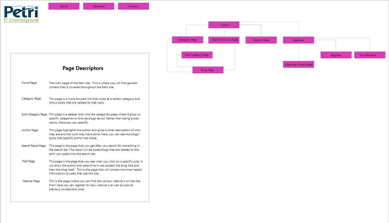
The website consisted of four main pages, with several sub-pages:
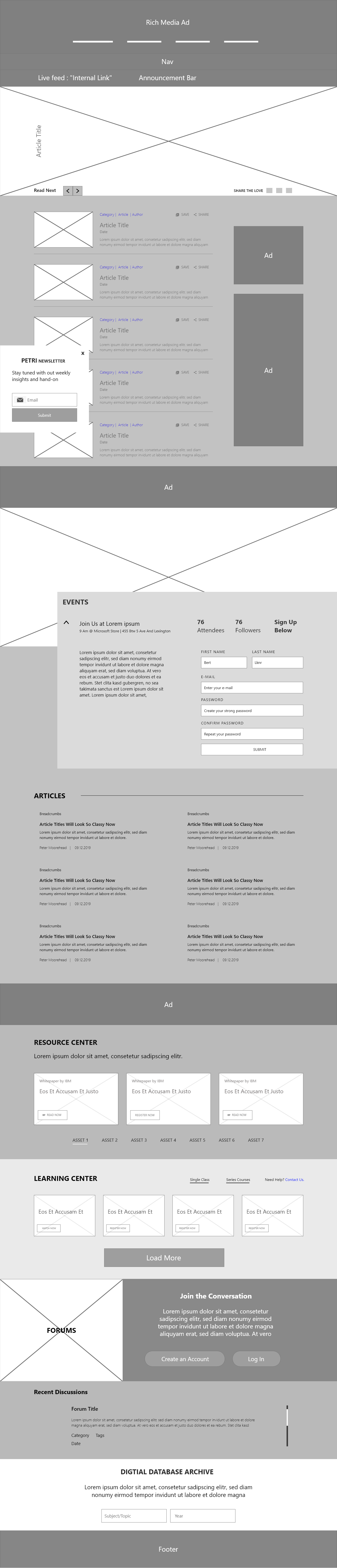
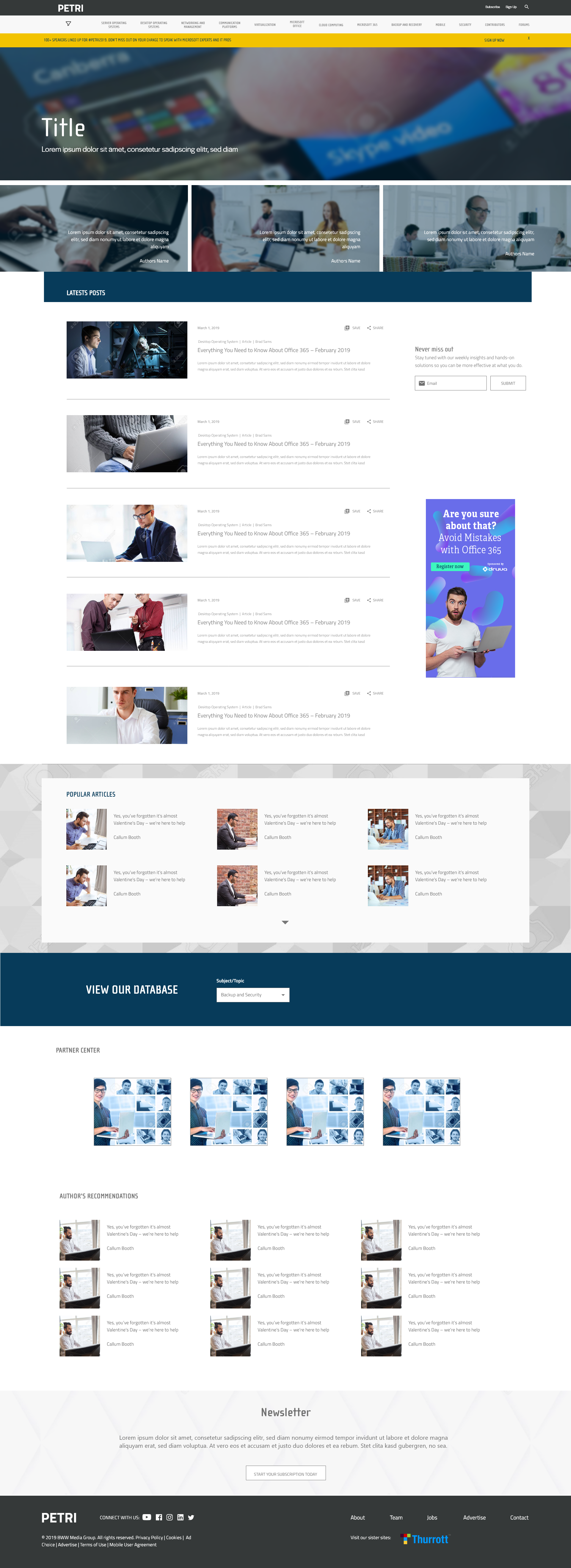
Home Page: The main page of the Petri site, where you find all the general content.
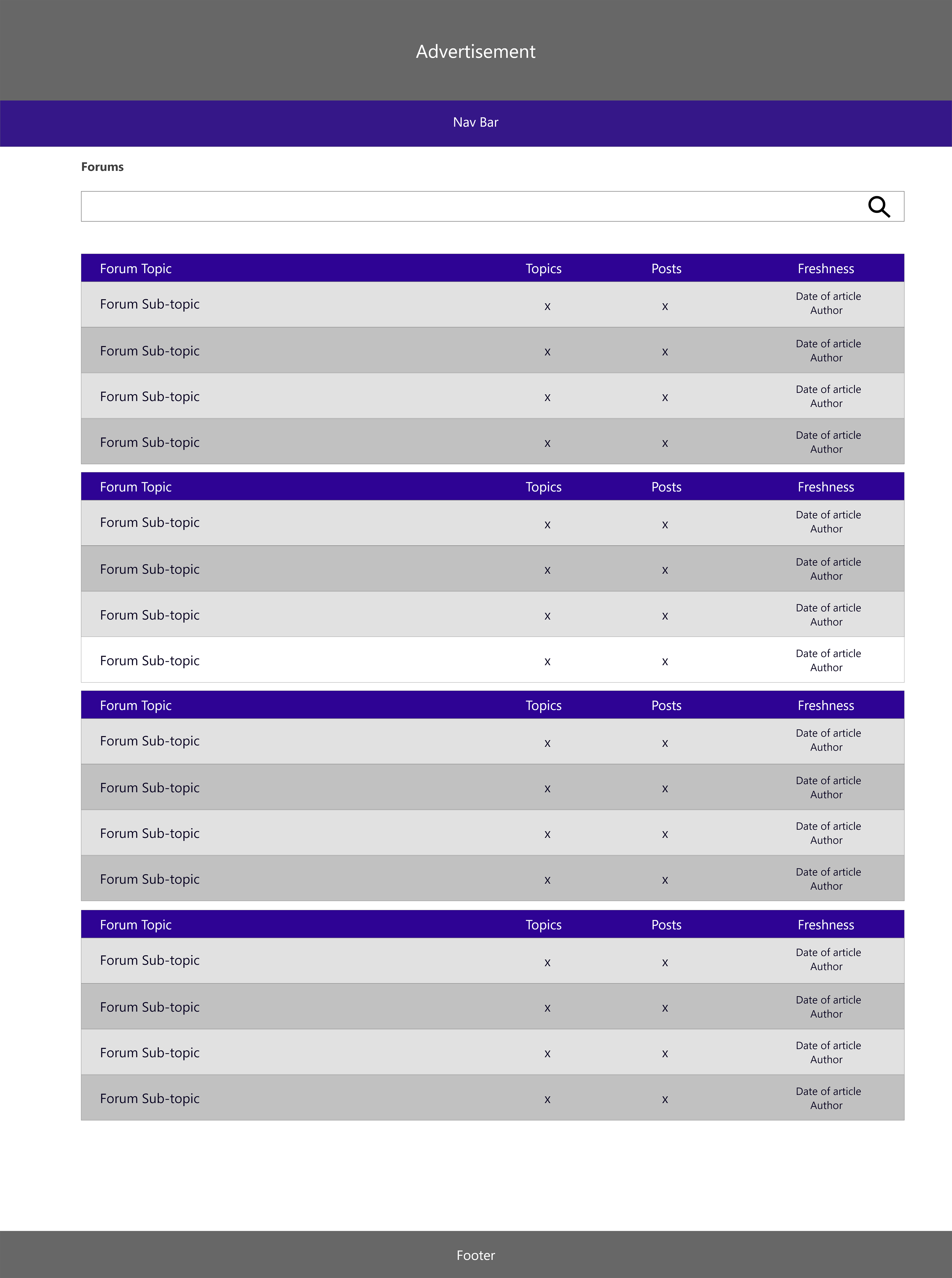
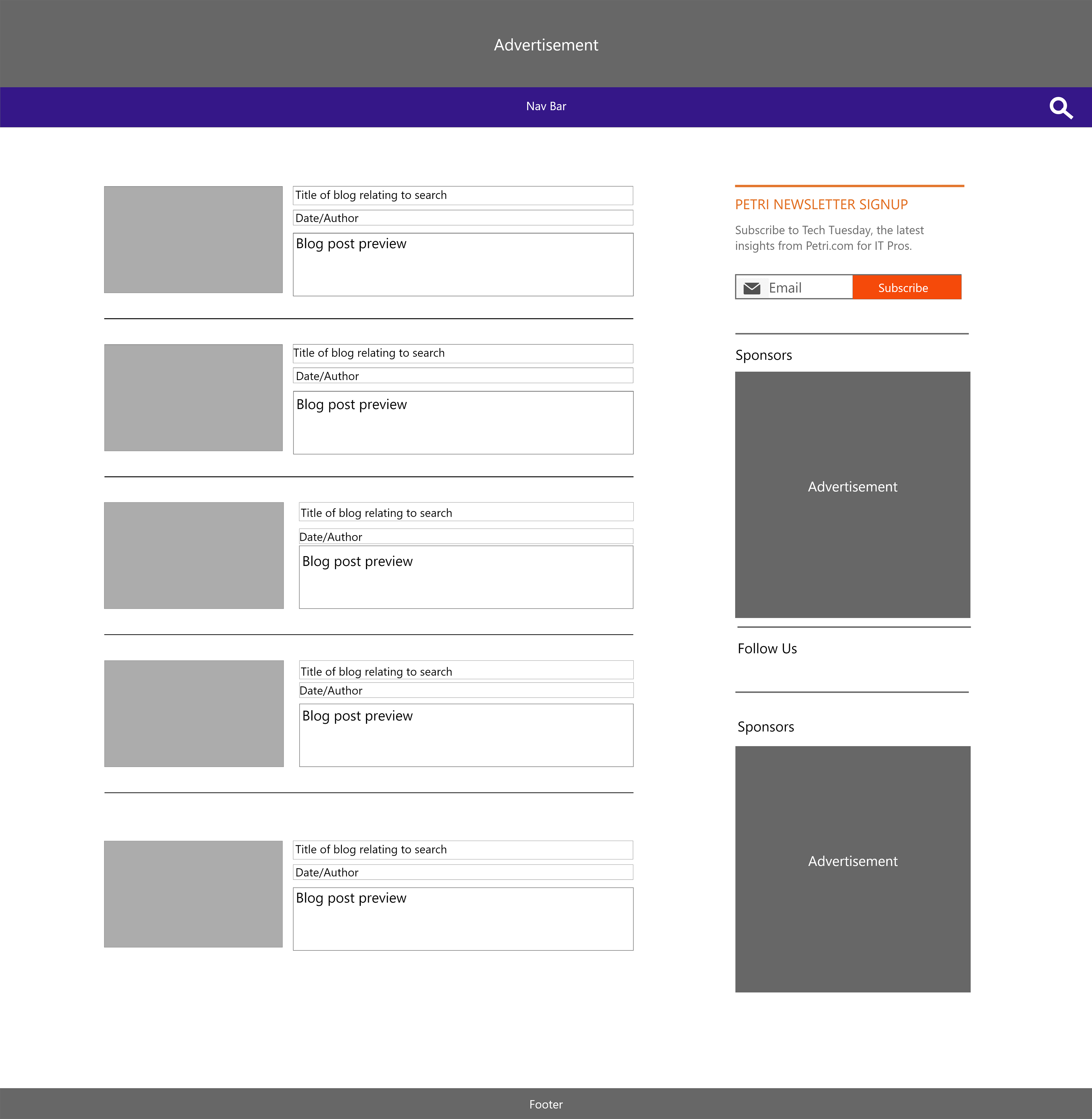
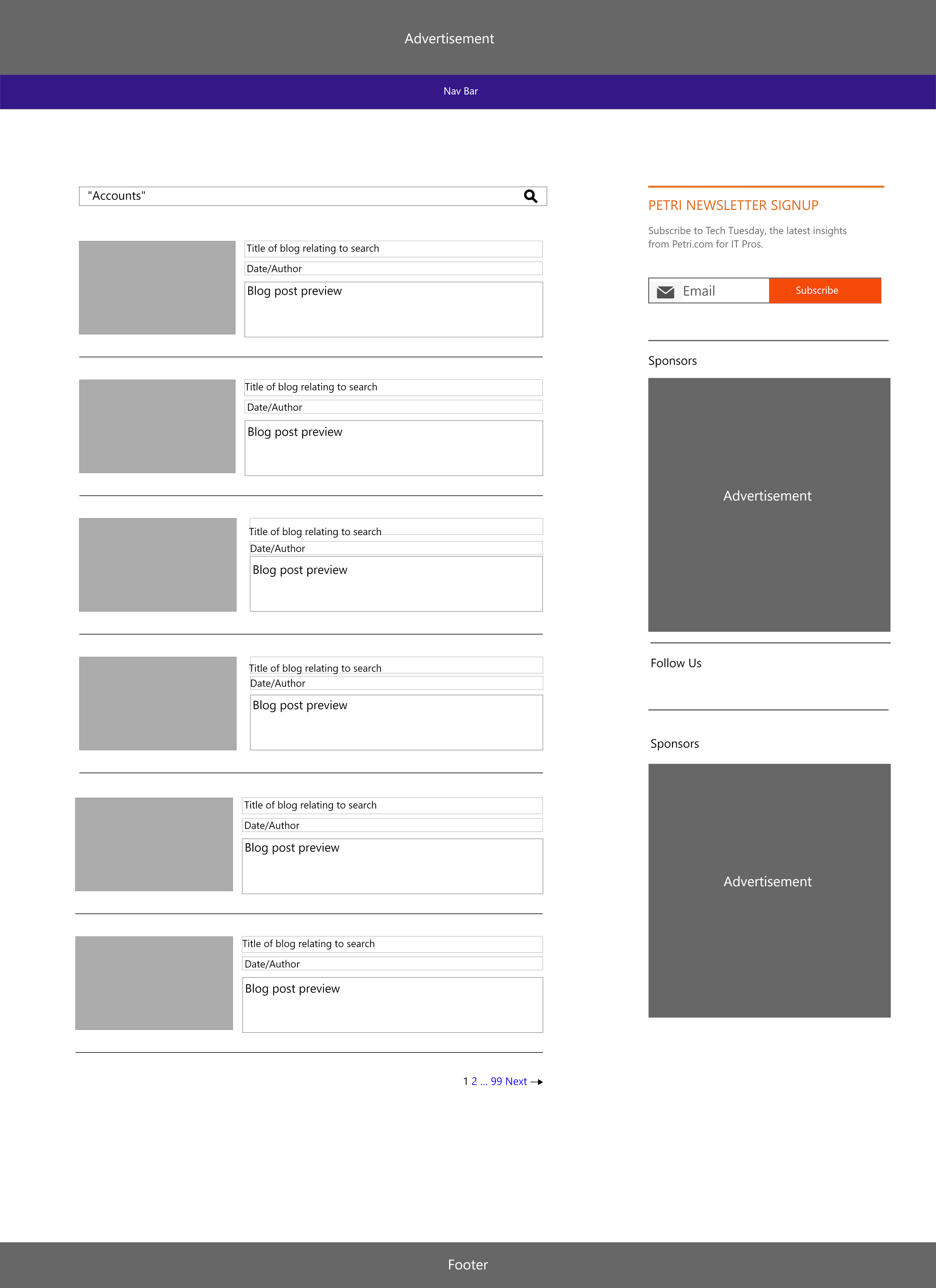
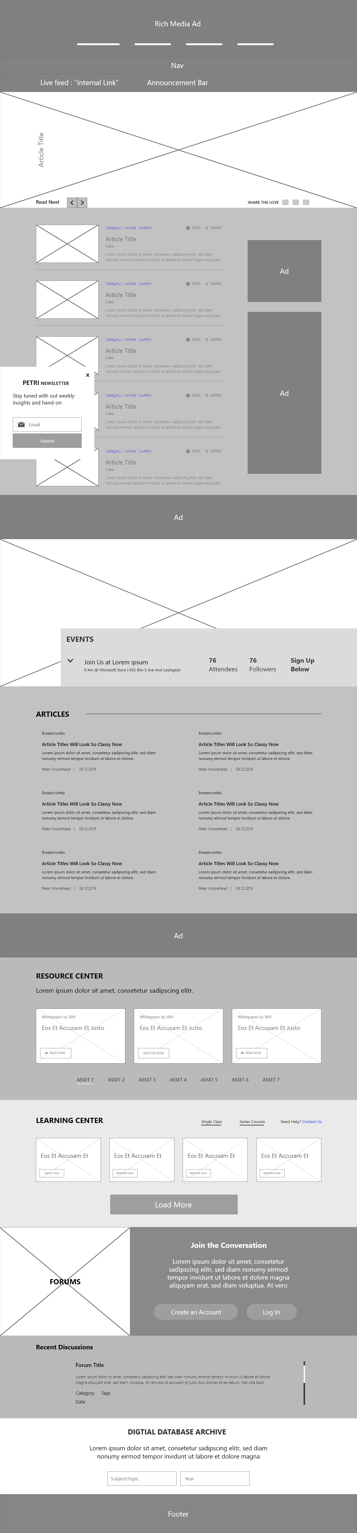
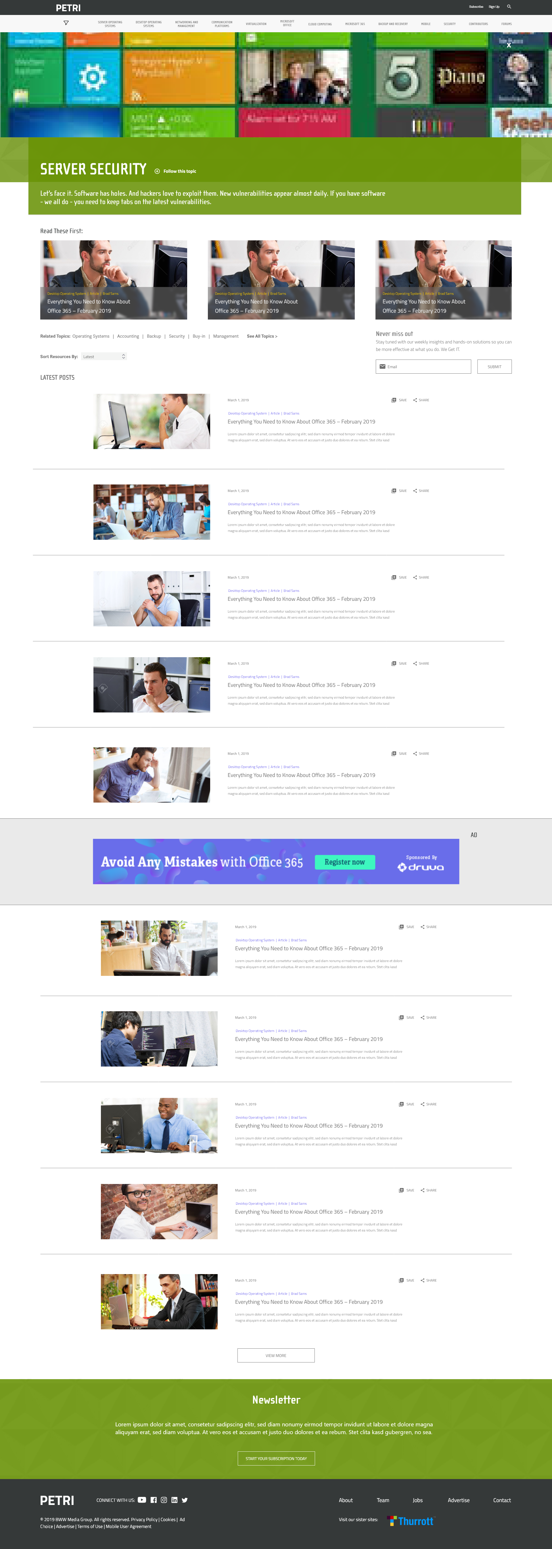
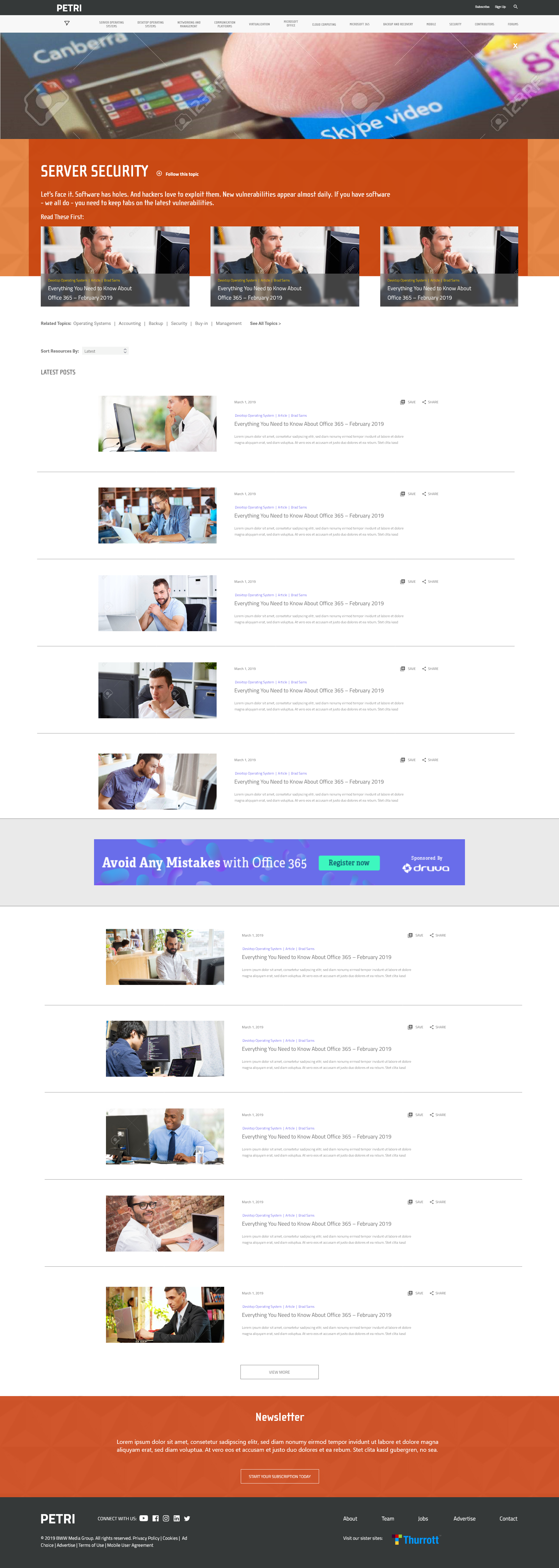
Category Page: This more focused link looks at a certain category and displays articles related to that category.
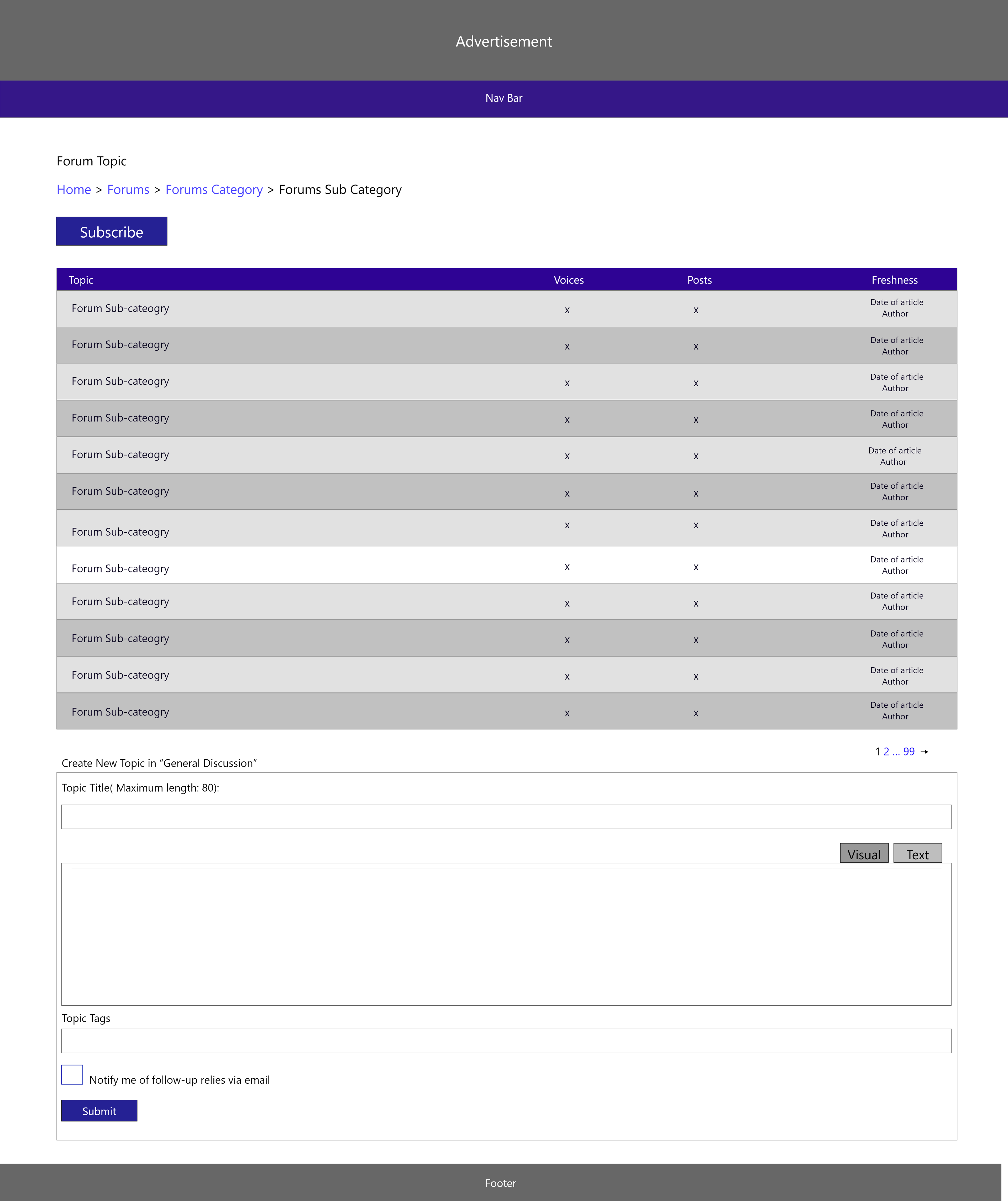
Sub-category Page: This deeper look at the category pages gives you more specific categories to browse.
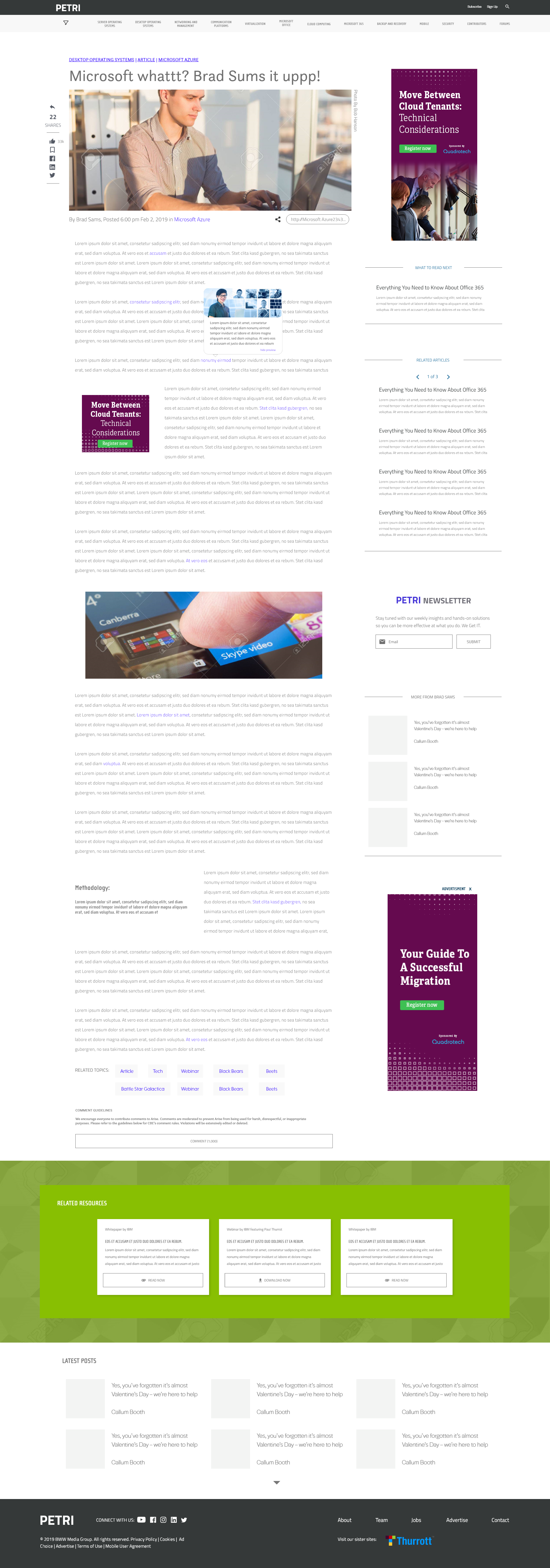
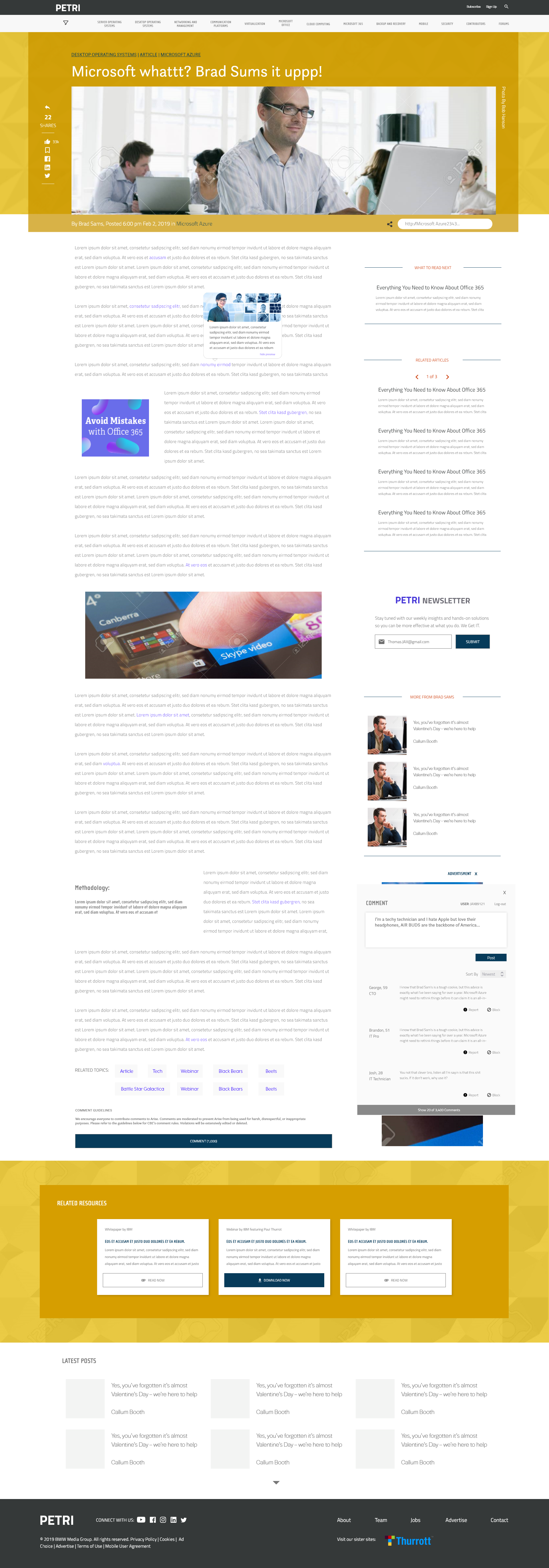
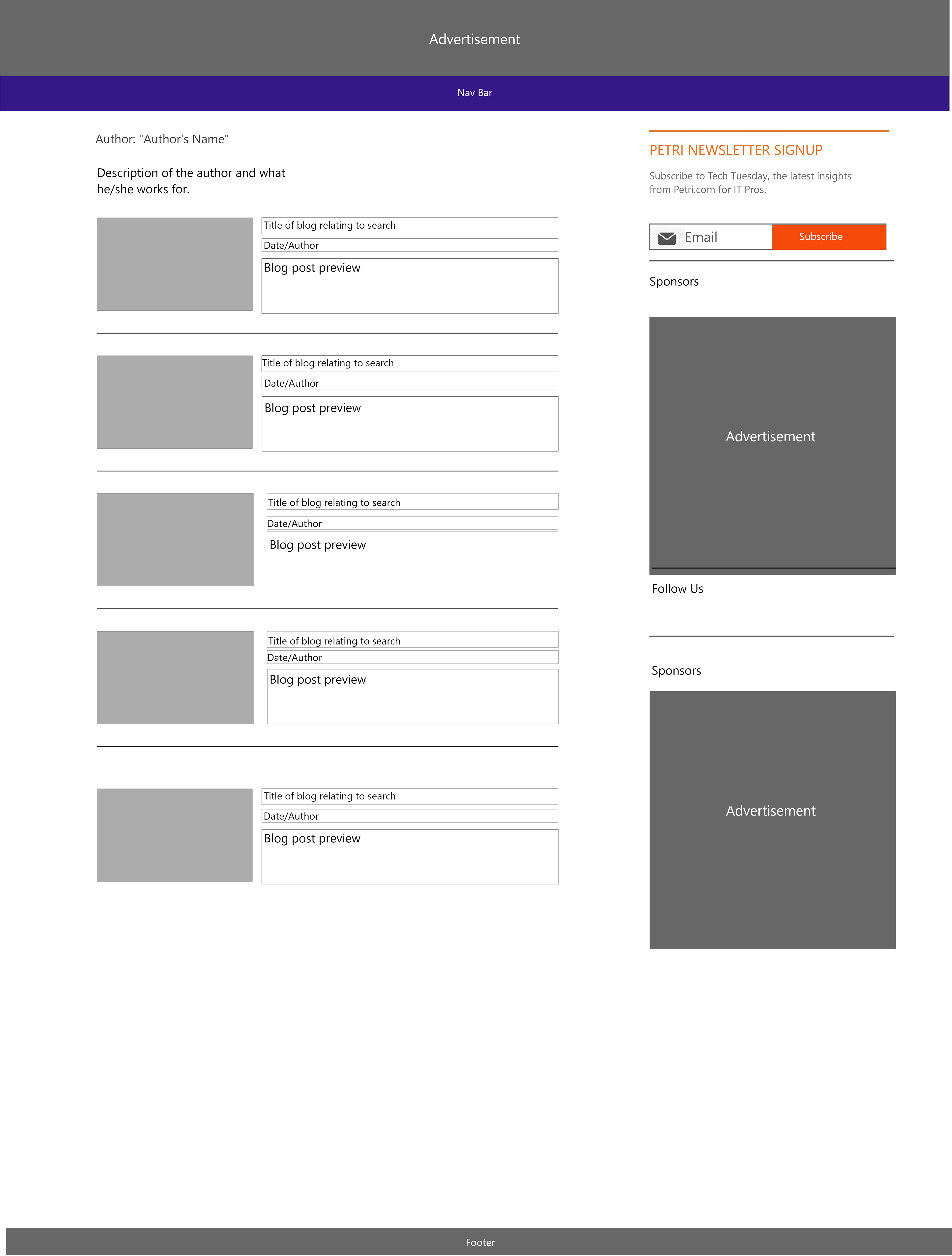
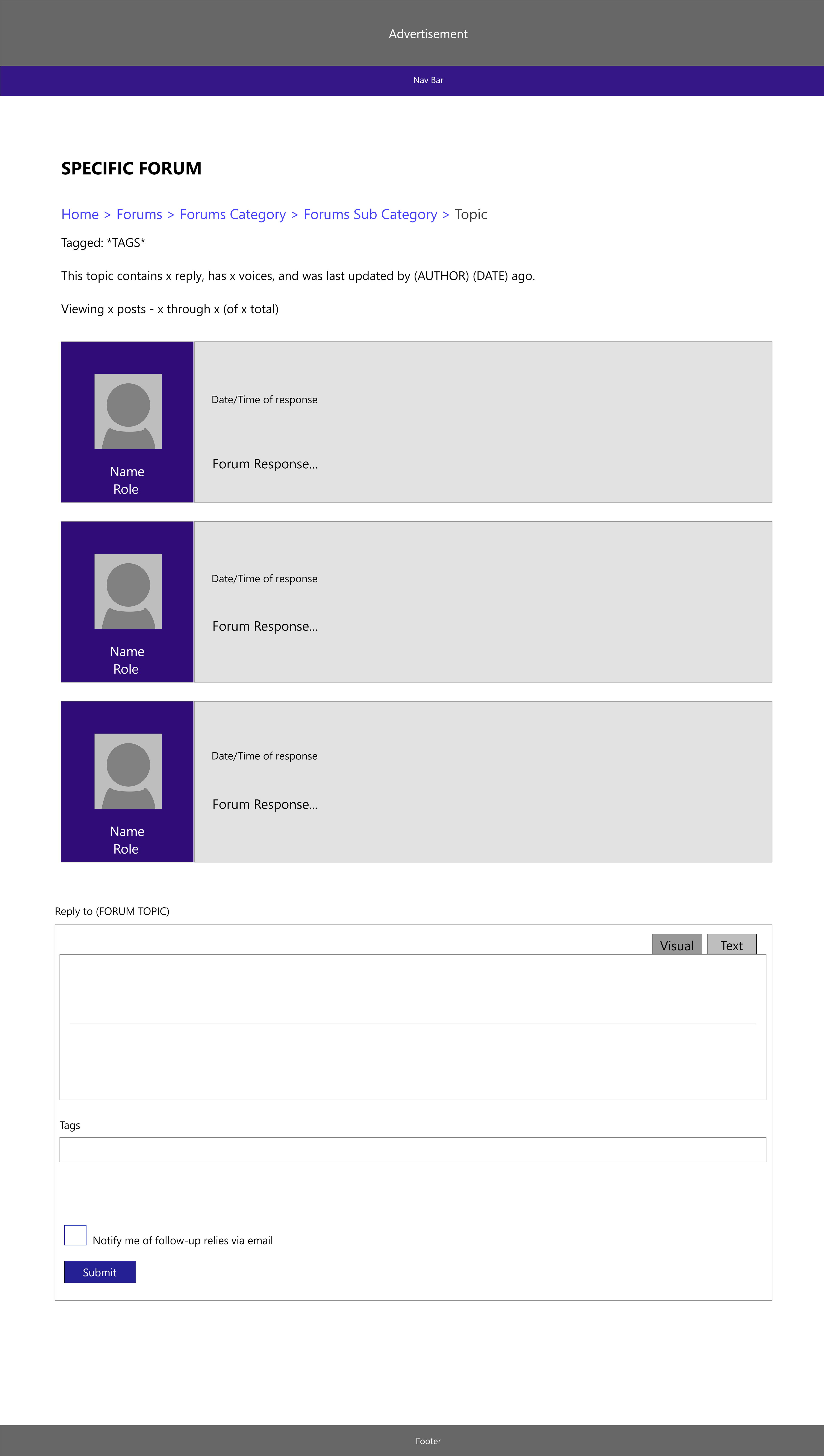
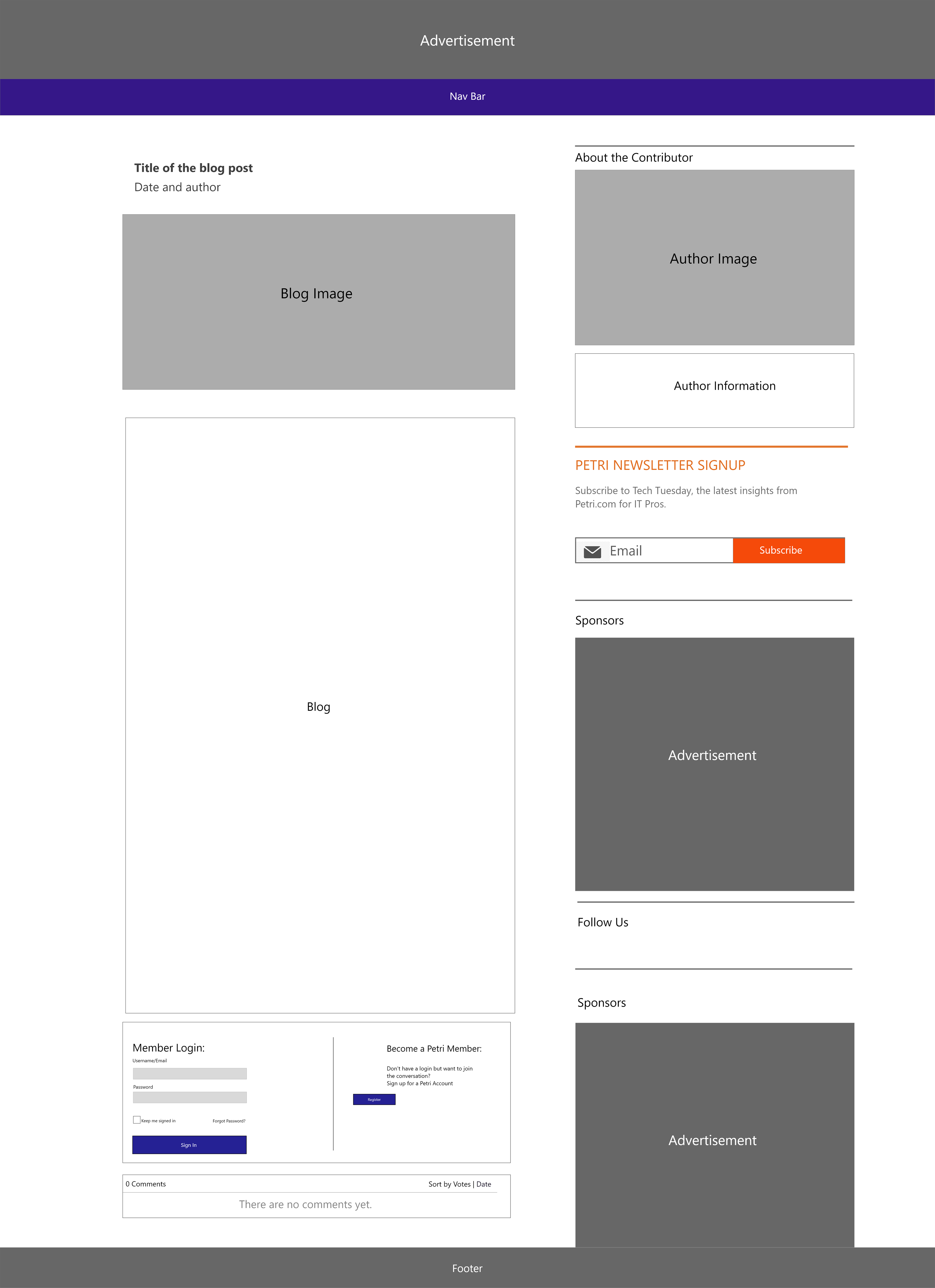
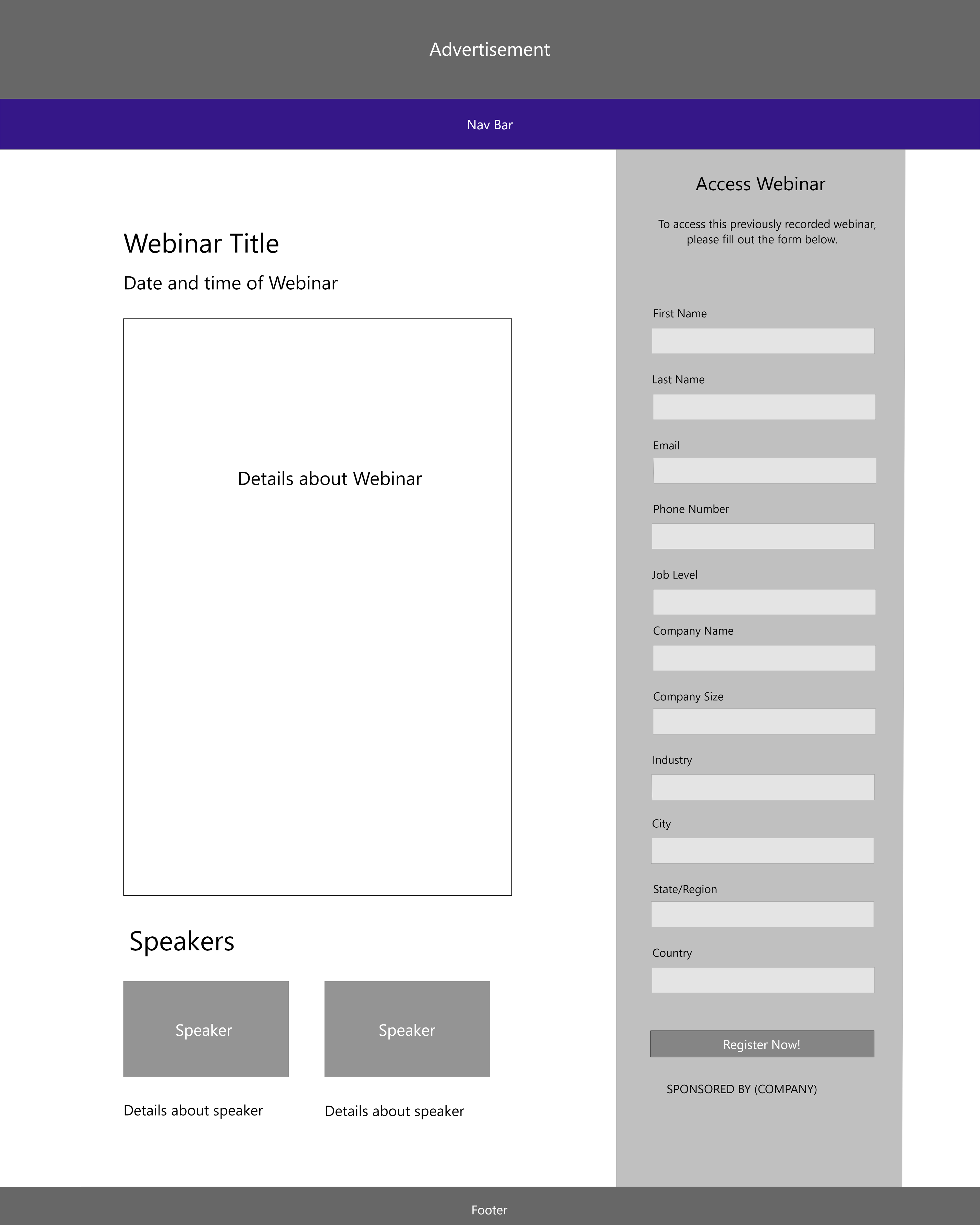
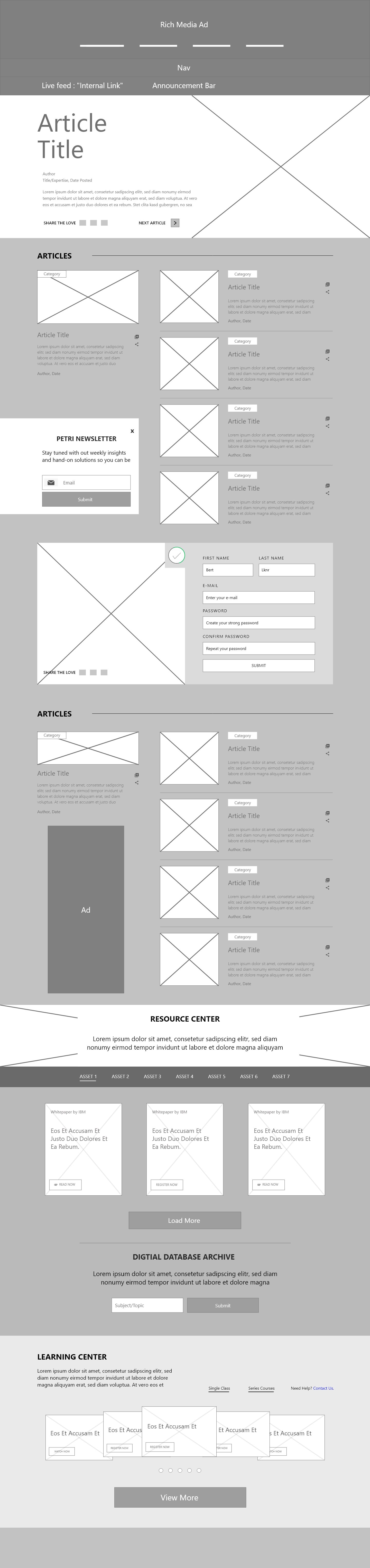
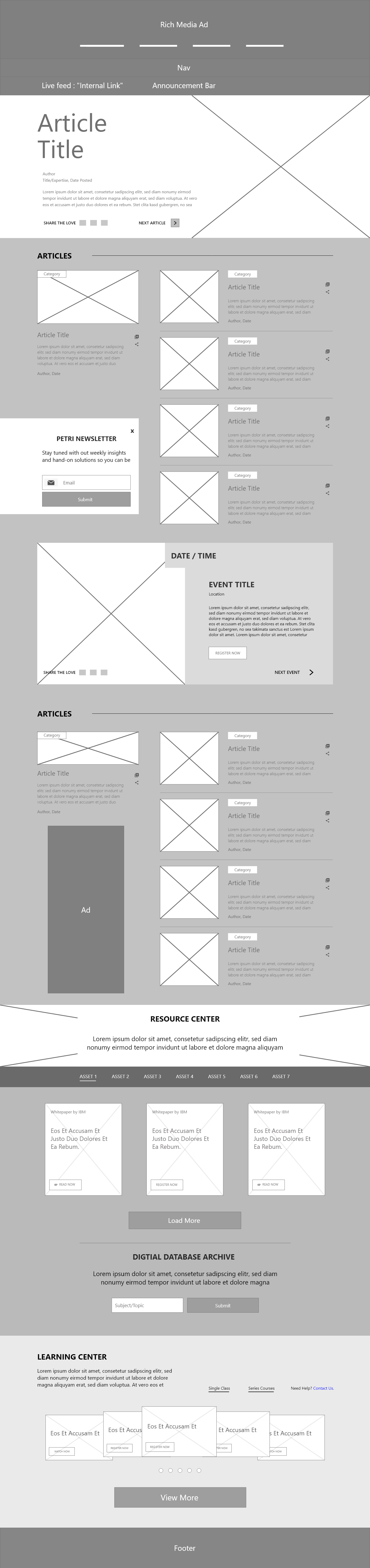
Post Page: This is the page that you see when you click on a specific post. It allows you to see the author, blog title, the blog itself and various features.
Initially, I looked at the current website and broke down all of the components so I could see what it was composed of and what was important to keep. I created wireframes of the website's current content.


I also created a site map to ensure that all of the navigational requirements would be met. The site map clarified the goals for the updated website.
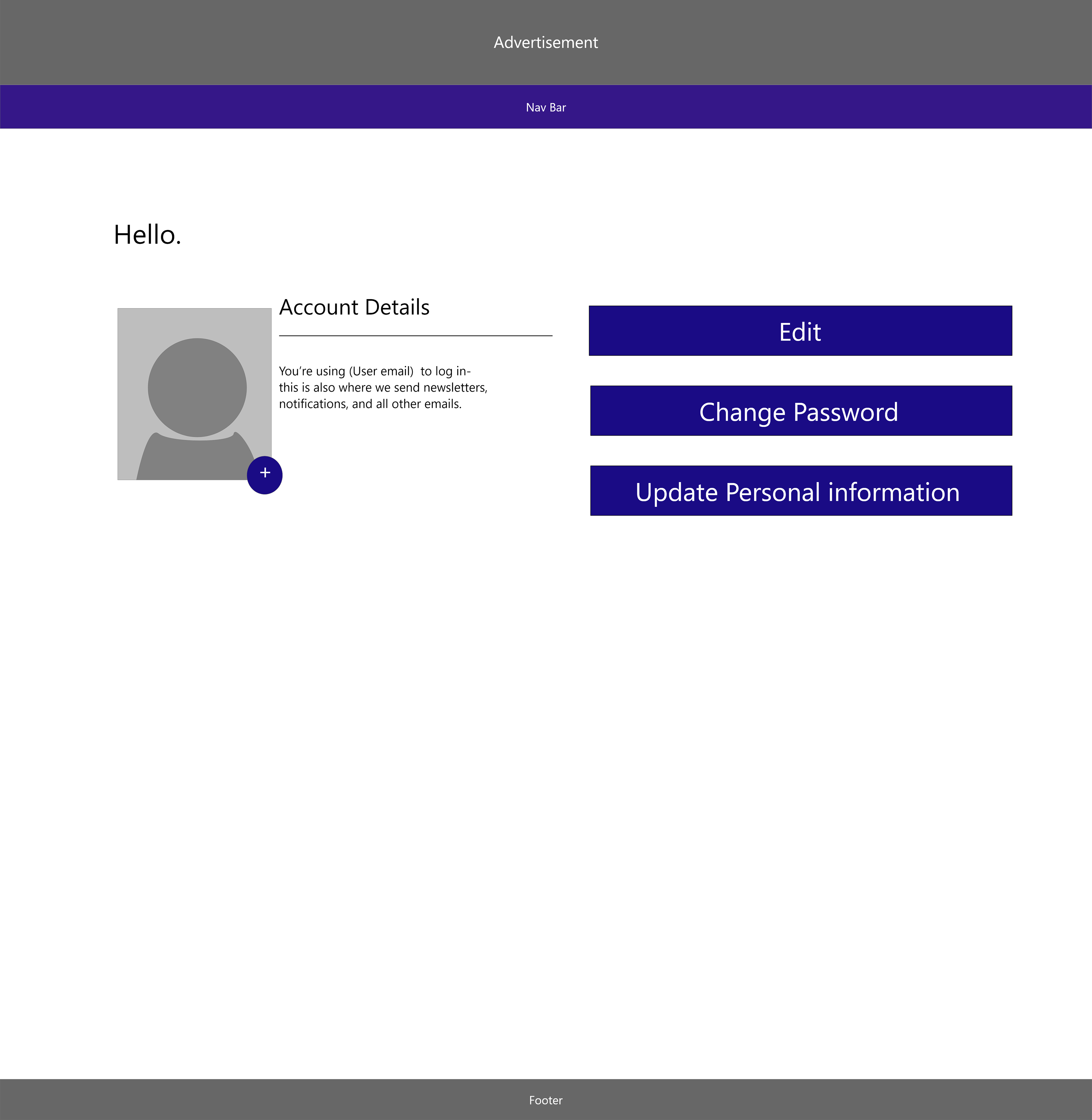
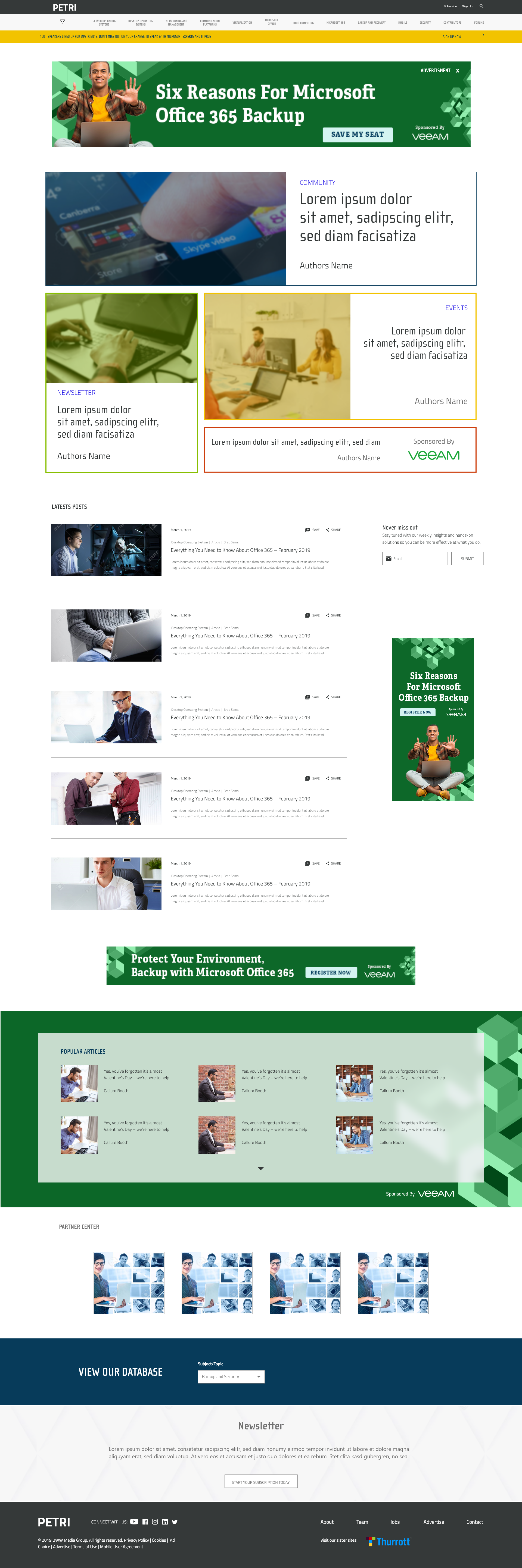
After meeting with the team, I learned that one of the main goals was to revamp the home screen. I created four different versions of the home screen to explore options. This home screen allowed you to see articles at the top, display a blog roll of various articles, promote different events and allow access to the resource center and the digital database.
After the team chose a homepage, we moved onto different sections of the site that needed revision, starting with the category pages.
The category pages display posts that are related to a specific topic. We focused on pushing both new content and topics related to articles that were read, to the top. We created a design that would push two or three articles to the top of the category page so the would be displayed first.

Next we revamped the post pages, the pages where the article posts appear. We added a quick summary feature which allowed the user to either get a quick summary of the article or to jump to a specific section of the page. Additionally, we added a static completion bar on the top of the page to indicate how much longer the article is.
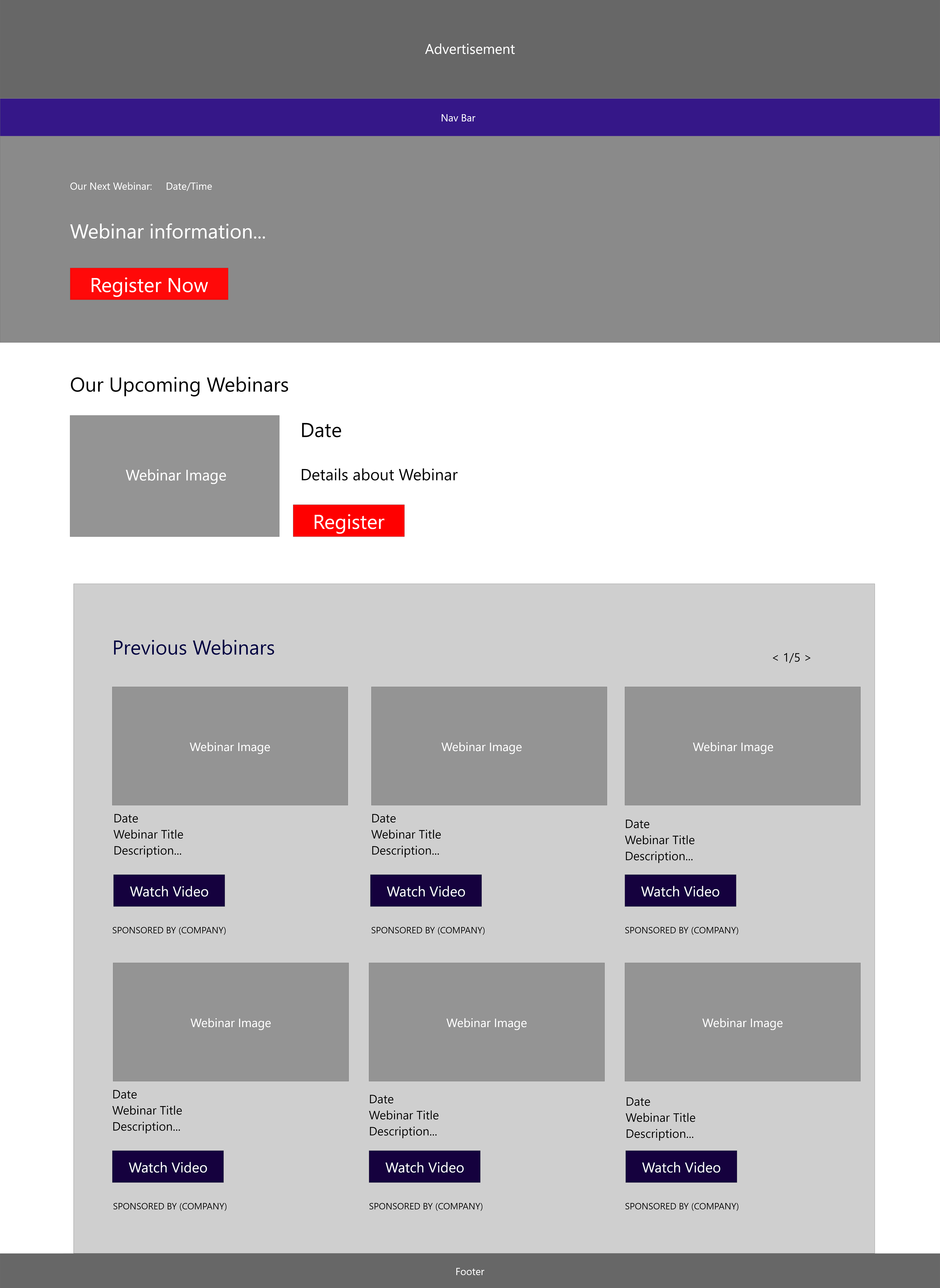
We also promoted more content by pushing sections such as "more from this author", "related articles", and "want to learn more about this topic?".
We then met with the team and gathered feedback to start designing more hi-fi wireframes, starting with the home page. This allowed us to see what the site would look like, and ensure that we had space for all of our features, ads and more.
Hi-fi wireframes of the category page.
Hi-fi wireframes of the post page